
This page explores how to use images in the JSOM web template.

Images Overview
Images add life, color and emotion to a web page. Deploying images thoughtfully can make a page more useful for our visitors. Generally, we only use images that serve a specific purpose, such as:
- Putting a face to a name
- Creating a sense of what it would be like to join a program, or attend an event
- Representing a piece of information with an icon to reinforce comprehension
The block you’re looking at right now is the standard block for opening a page. It consists of an image with class right45, an h2 with class top-header, and some descriptive text that introduces the page.
Guidelines for Using Images
Use one image per page, as a rule of thumb.
Sometimes, no image is needed or available; sometimes, many are. But one great image is often all that is needed because:
- More images slow down the page’s load time, which affects user experience and search ranking,
- Multiple images distract users from the purpose of the page, and
- One appropriate image often means that the page is well-organized and focused on its purpose.
Use JPG and PNG formats appropriately.
Use .jpg and .png formats appropriately to optimize the file size and image quality.
- Photographs should be in .jpg format.
- Flat graphics, like logos and icons, should be in .png format.
- Use the JSOM Web Services Photoshop techniques document and JSOM Web Services face guide template for guidance on consistent practice on our websites.
Every image needs a brief, descriptive alt attribute.
- The alt attribute should describe the photo for someone who can’t see it.
- If a photo is captioned with the figcaption, still add a alt value to ensure web accessibility. In Web Services, we tend to write alt values ourselves and let content owners provide captions if they want them.
- If images are in a series, give the first image the alt attribute and give the rest <alt>="".
If someone requests an album or slideshow…
If someone requests an album or slideshow, we advise them to host the photo album somewhere else (such as a social media platform, where people are used to sharing and viewing photo albums), and we ask them for a representative photo for the collection and a URL for the photo album. We will display one photo on a web page, direct users to click a link if they want to see the album and provide a link to the album URL.
Hyperlinked Images
Do not use photos as hyperlinks. Hyperlinks should primarily be in the form of text or buttons. In some cases, we use boxed text as hyperlinks..
HTML Structure
The basic template for including an image on a page follows. Figcaptions are not always requested. Only include figcaption when it’s requested.
        <figure class="[size/position class]">

              <img src="[relative path, if possible]" alt="[alt attribute that briefly describes the photo if the user can't see it]">

            <figcaption>

                [descriptive caption]

            </figcaption>

        </figure>
Wrap an image with a picture element when using srcset to serve different images depending on screen width. Only include figcaption when it’s requested.
        <figure class="[size/position class]">

            <picture>


            <source media="(min-width: 40em)" srcset="[relative path, if possible]">

           <img src="[relative path, if possible]" alt="[alt attribute that briefly describes the photo if the user can't see it]">


            </picture>

            <figcaption>

                [descriptive caption]

            </figcaption>

        </figure>
Sizing and Preparing images in Photoshop
Images for the web need to be optimized for the size and quality: the image should be no larger – both in pixels and bytes – than it needs to be in order to display crisply on the web page. A good way to determine the width needed for an image is to inspect the maximum width of the class you will use to size and position the image. You can review the size/position classes in the Colgrids section of Structuring a Page and look at different screen widths so you know the largest possible display width for a photo.
| Class(es) | Source image width |
|---|---|
| left25, left33, left45, left50, left55, right25, right33, right45, right50, right55 | 600px |
| left67, right67 | 710px |
| fullwidth | 1080px |
| hero | 1920px by 960px, exactly |
| featured image (in a post) | 630px |
Use Adobe Photoshop to size images. When you export the image for web, JPG images need to be set to Quality: High, which is also 60/100 on the quality slider. This quality setting is a good balance of image quality and efficient file size. (PNG files do not have a quality option.)
Hero images are much larger, so save them to lower quality in Photoshop, such as Quality: Medium or 40/100.
Portrait Images
When someone requests adding a portrait of someone to a webpage, JSOM Web Services uses a 256px by 256px square template. This template keeps the size and scale of the person’s head consistent across the Jindal School web sites.
In order for the image to look good and crisp, the source image needs to be high resolution, at least 256px by 256px. If the image is smaller than 256px by 256px then we will have to enlarge it, which causes image degradation.
Hero Images
Hero images are available for high-traffic or otherwise important pages, usually top- and second-level pages. Hero images should feature a happy- or engaged-looking person or group of people doing something relevant to the web page, and the purpose of the image is to connect emotionally with the user and introduce the page’s concept.
Hero images appear at the top of the content area, just below the page header, such as on the MBA home page. (This “Using Images and Graphics” page displays the hero image in the wrong location; on any other page, the hero image is the first element in the content field, so it appears directly below the template header.)
Hero images are optional. Some content owners will prefer not to use them because the large image pushes other important content further down the page.
See three types of hero image templates below by clicking on the call-to-action links.

Standard Hero Template
The large text above is brief, attention-grabbing text. The background color of this box can be any of our standard template colors; choose one that looks good with the hero image.
See Dark Image TemplateSee Light Image Template


Using Images and Text Together on a Page
You can include an image, with or without a caption, on the left or right side of a block of text. Images can also appear full-width above, below, or in the middle of a block of text.
Use a parent class imagestory to contain both the image and the text. Then, size and position the image with the same classes used with colgrid – left25, left33, left45, left50, left55, left67, right25, right33, right45, right50, right55, right67, or fullwidth. Add the size/position class to the outermost element associated with the image, usually figure, but sometimes picture or img.
Using this imagestory method allows any text that follows the image to flow around the image, depending on the screen width. See a few examples below.

Text with Image on the Left
The figure element with left33 class contains both the photo and the caption, and depending on the screen width, the relative width of the image changes accordingly. When using classes that cause an image to float, it is important to add an empty div with class clearfix before or after the closing div of the imagestory element, which prevents elements further down the page from also flowing around the image.

Text with Image on the Right
Just changing the size/position class or the figure element moves the image to the right. Because this image has no caption, the img element has alt="John Oyedele, MBA ’16" instead of alt="".

Text with Image Full-width
For image-and-text designs that use the class full-width it is best to use an image that is not very tall and is also wide enough to be clear at full screen width, which is 1080px wide. The image above is 1080px wide by 360px tall, which is a 3:1 ratio.
For images that use the class full-width, the two divs with classes imagestory and clearfix are not necessary, because the full-width image is not floating. Based on our web standard for readability, this section has replaced the imagestory class with narrow, so that the lines of text are narrower and easier to read.
Other Examples of Using Images and Text Together on a Page
The JSOM web template uses different kinds of blocks for design consistency and to achieve different goals. Use the links below to see examples of the blocks and how they work.
Images with Colgrid
When organizing a page with colgrid, add the class fullwidth to any image that is inside one of the size/position element if you want the image to take up the full-width of that element.
Containing the image with colgrid instead of imagestory separates the text and the image into distinct columns, so the text will never flow around the image. Also, on mobile the elements will stack on top of each other in the order they appear on the page.
Images in Posts
A post (as opposed to a page) should have two types of image. Below is a summary of each image.
- One img element at the top of the post with class center (strongly recommended)
- One Featured Image selected (required)
Post Image
Adding one img element with the class center to the top of the post makes the post more visually and emotionally engaging. Often the image is a photo of the author of the post. If an author image is not appropriate for the post, look for a concept photo that supports the article’s theme. See the html for the post image below.
        <figure class="center">

            <img src="[path to image, relative if possible]" alt="[describe the image for someone who can't see it]" >

            <figcaption>[descriptive caption]</figcaption>

        </figure>
As always, if a caption is not available or if it doesn’t seem necessary, then figcaption is not necessary.
Featured Image
Each post needs a Featured image selected using the WordPress interface at the bottom of the right column of the page editor. The Featured image is what is used on Category pages and when embedding posts dynamically on a page. See below.

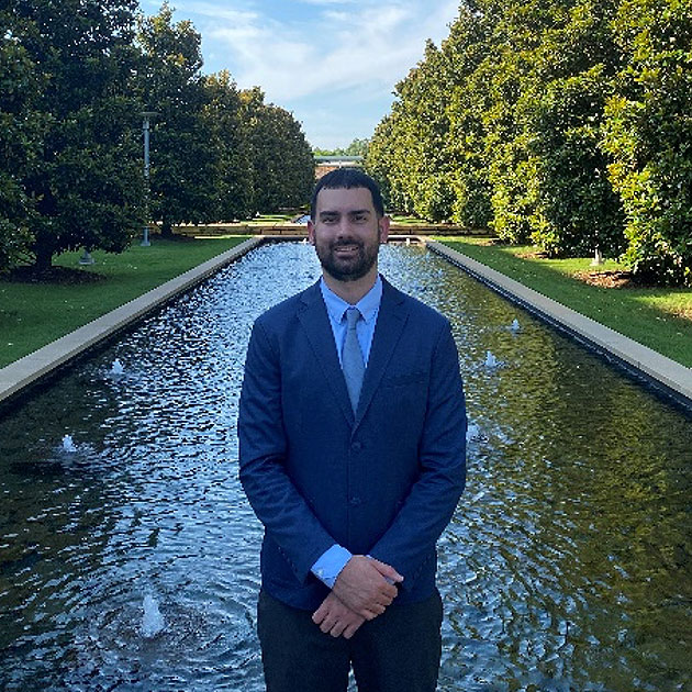
Hillary Mai Dang, BS’22
Hillary Mai Dang, BS’22, recently obtained an administrative fellowship at the Harris Center for Mental Health and Intellectual and Developmental Disabilities (IDD) Administrative Fellowship Program. After graduating in 2022 with a BS in Healthcare Management, with honors, she interned at the Meadows Mental Health Policy Institute, where she was eventually promoted to project coordinator for the Center for Health System Transformation.

Sonal Patel, MS’24/ MBA’23
Sonal Patel, RDN, is a Public Health Specialist at Dallas County Health and Human Services. She completed her MBA/MS in Healthcare Leadership and Management at the University of Texas at Dallas in 2024. As a dedicated health and wellness professional, Patel brings a wealth of experience from corporate wellness to clinical practice, consistently achieving high patient satisfaction and improved health outcomes. With extensive expertise in program development and implementation, she excels in communication and collaboration, making her a valuable asset in any health and wellness initiative.

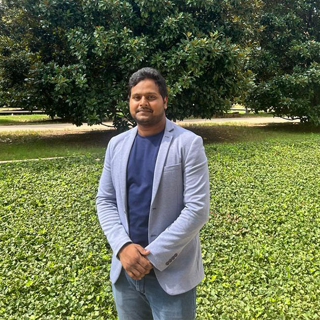
Dr. Sai Lakhan Kyasa, MS’24
Kyasa is a dedicated physician from India. Upon graduating from the MS Healthcare Leadership and Management program, he secured a position as a Clinical Research Coordinator at Harvard Medical School and Massachusetts General Hospital. With a robust proficiency in Epic software, eClinicalWorks, and clinical monitoring, Kyasa brings a diverse skill set to healthcare operations. His expertise extends to research design development, marketing strategy, and the pharmaceutical industry. Kyasa is committed to advancing healthcare outcomes and is eager to connect and collaborate with others in the medical community on innovative healthcare solutions.

Rolando Perez, BS’20/ MS’23
Perez is a distinguished MS Healthcare Leadership and Management graduate from UT Dallas. During his time there, he also served as the president for the Elite Scholar and Leader Program. He is currently working as a Schedule Capacity Analyst II at UT Southwestern Medical Center. He also serves as the Vice-Chair for the ACHE NTX Student Council and as the Chair for the Member Engagement Committee for NALHE DFW. Driven by a commitment to innovation in healthcare, Perez aims to enhance healthcare quality and access while reducing costs, ensuring that everyone can afford high-quality care. Deeply rooted in Texas, he is dedicated to fostering collaboration and understanding within the healthcare community, believing that unity and mutual respect are key to achieving common goals.

Lester Dsouza, Class of ’21
Financial Analyst at CBRE
During my research for a good graduate school, I saw that the MS in Finance at JSOM offered more than just quality education, it provided an access to huge knowledge pool and experience from the faculties and the peers alike. It had the widely diverse class with students from all around the world to learn from, while having 200+ student organizations to develop myself outside of the classroom and make friends. Being located really close to Dallas, a major city which has great opportunities also influenced my decision to enroll at JSOM.

Monique Tran, MS’25, BS’23
Monique Tran, a Spring 2025 MS graduate and fast-track student, has been a standout member of our program since her undergraduate years. While she initially pursued a clinical path, her internships with Elevance Health, Parkland Health, and Amentum sparked a deeper interest in the broader impact of healthcare systems. Monique’s academic excellence is reflected in her outstanding 3.9 GPA, and her leadership as Vice President and President of the Elite Scholars and Leaders Program.

Steven Match, MS’24
Match is the Director of Procurement Solutions at Vizient, where he leads initiatives aimed at improving healthcare performance. With a focus on leveraging analytical insights and fostering client partnerships, Match drives project success through strategic thinking and outstanding communication. His dedication to maximizing the benefits of Vizient’s offerings across diverse client scenarios highlights his commitment to enhancing efficiency and effectiveness in healthcare procurement. Match’s ability to build positive relationships and deliver strategic solutions underscores his expertise and enthusiasm in the field.

Gaurav Sethi, BS’20
Investment Bank Risk Analyst, JP Morgan
Sethi works at JP Morgan as a specialist in counterparty credit risk calculations, doing the heavy analysis that most don’t even know exists – he investigates and explains derivative exposure variances and changes. Sethi earned both finance and actuarial science undergrad degrees. (Actuarial science is in the UT Dallas School of Natural Sciences and Mathematics.) Notably, Sethi was awarded the prestigious $15,000 Mitchell Family Foundation Scholar Award from the Texas Business Hall of Fame Foundation, based on his work with CampusOven, a service that connects university employees and students with caterers who are focused on healthy eating options.
Ian Martinez, Class of ’21
DVC informatics Analyst at Houlihan Lokey
I chose my MS degree in Finance at JSOM primarily because of the curriculum and the faculty staff. The courses taught covered all of the areas in finance and it gave the opportunity to specialize in different concentrations, such as financial technology or investment analysis. Additionally, the faculty is very well prepared and up to date in the latest research.
Turning Adversity into Achievement: Abinav Bayya’s Academic Transformation
Abinav Bayya came to the Naveen Jindal School of Management to pursue his Master of Science in Supply Chain Management. After a turbulent first semester, Bayya found himself on academic probation.

Long Ly, Class of ’21
Investment Analyst at Invitation Homes
The experience was wonderful, learning from the JSOM professors has shaped me personally and professionally. The JSOM students there were also very intellectual and curious. It was a great educational experience.

Abhishek Sharma, Class of ’21
Finance Manager at Amazon
My background experience was a mix of technical qualifications as a software engineer and work experience as a futures trader and Sales Finance Manager. Even though I had worked in the finance domain in different capacities, I didn’t have experience of academic finance and when looking for options for my graduate level education my priority was to complement both my previous education and work experience. The MS Finance program at JSOM not only fulfilled all the criteria but also boasted of world class faculty and a very enhanced learning program and facilities.

Andrew Joseph Limas, BS’19
Assistant Language Teacher, RCS Japan
After graduating from Jindal School with a bachelor’s degree in Business Administration, Limas signed up with RCS Corporation Japan, a staffing company based in Tokyo that finds English teachers for local schools. The company placed him in a job in Tokyo, where Limas now works as an assistant language teacher. In his role, he shares language skills with his students along with information about American culture and traditions. He credits opportunities to work on start-up business ideas at the Jindal School with expanding his understanding about how businesses work.

Jason Mikhaiel, BS’22/ MS’23
Jason Mikhaiel is the Medicaid Eligibility Area Manager, following his role as a CSO Manager in Training at Parallon. With extensive experience in customer service and a passion for engaging with people, Mikhaiel is always eager to gain new experiences and embrace new opportunities. He recently earned his Master’s degree in Healthcare Management from the University of Texas at Dallas. Mikhaiel thrives on challenges that push and motivate him to innovate and find better ways to accomplish tasks. He believes in the endless pursuit of knowledge, regardless of one’s experience or tenure.

Karun Joseph, BS’22/ MS’23
Karun Joseph is a Senior Sourcing Analyst at Health Care Service Corporation. She graduated from the MS in Healthcare Leadership and Management program in 2023. Joseph has successfully implemented sourcing strategies and processes, managed supplier relationships, and led cross-functional projects aimed at optimizing continuous improvement within the procurement organization. Her expertise in strategic sourcing and process improvement is instrumental in enhancing the efficiency and effectiveness of the procurement function.

Blake Cedeno, BS’21, MS’23
Assistant Market Director – Patient Access, Parallon HCA Healthcare
Cedeno started his career with Parallon in January 2022 as part of Parallon’s Manager In Training program where he served at Medical City Dallas, Medical City Heart and Spine, and Medical City Arlington. Cedeno received a recent promotion to Assistant Market Director for Patient Access where he continues to drive exceptional operational performance and deliver team engagement. During his tenure with Parallon, Cedeno has been involved with many projects and has been instrumental in Medical City Dallas’s top tier performance. Cedeno graduated from The University of Texas at Dallas with a Bachelor’s Degree in Healthcare Management in 2021 and his Master’s degree in 2023 as part of the Healthcare Leadership and Management program.
Info Grid and Stat Boxes
Depending on the type of data to be displayed on a web page, using the grid or statistic designs are available to feature chunks of information in a clean and visually-oriented format.
Info Grid
The info grid design is used almost exclusively to showcase student profile information, and to give users an idea of the kinds of people currently or recently in a program. An Info grid uses either colored or bolded numbers to reinforce a piece of information.
Stat Boxes
In cases where the data is focused more on statistics or rankings, the stat box is the more suitable approach. Rather than using images, a stat box uses bold numbers or, sometimes, text to reinforce the message of the data. They are individually boxed up to keep information separated and easier to read.
See info grid belowClass Profile – Full-Time MBA Class of 2024
50
Class Size
Average Test Scores
675 GMAT
312 GRE
28
Average Age
Top Three Undergraduate Majors
Business, Engineering, Psychology
3.4
Average GPA
Origin
36% International
Countries represented: Angola, Brazil, India, Italy, Korea, Nigeria, Russia, Taiwan, Turkey and Vietnam
Notable MBA Rankings
no.12tied / no.33tied
Best Full-Time MBA Program
No. 12 (tied) among public university programs and No. 33 (tied) overall, U.S. News & World Report (2021)
no.1
Salary-To-Debt Ratios of MBA Graduates
U.S. News & World Report (2017), Top 10 Short List comparing salary-to-debt ratios of MBA graduates at ranked business schools
no.15
Among U.S. Public University Programs
Best Business Schools 2019, Bloomberg Businessweek
no.36
Overall Among U.S. Schools
Best Business Schools 2019, Bloomberg Businessweek
no.6tied
Among Best Online MBA Programs
U.S. News & World Report (2019)
no.10tied
Among Public University Professional MBA Programs
U.S. News & World Report (2020)
no.17
Overall Among U.S. Professional MBA Programs
U.S. News & World Report (2020)
no.18 / no.1
Best Business School for Networking
No. 18 nationally and No. 1 in Texas, Bloomberg Businessweek
We believe that having small, intimate programs in a big school optimizes your opportunity to meet and connect with the people who will become your lifelong social and professional network.
Charts
This template allows for embedding and customizing Google Charts to create graphic displays. The three charts most frequently used are:
- Bar graphs
- Pie charts
- Maps